
Airquality analysis with Shiny App
This shiny application is deployed to Rstudio shiny server. Here is the app link. And Source code link
Summary
Airquality dataset is a daily air quality measurements in New York from May to September. Quality values include:
- Ozone
- Solar.R
- Wind
- Temp
The question this shiny app is trying to address is how Ozone values change when Solar.R, Wind or Temp values change. So, We’ll need to plot Ozone data against the other three measures.
Shiny App UI design
This app uses sidebar layout.
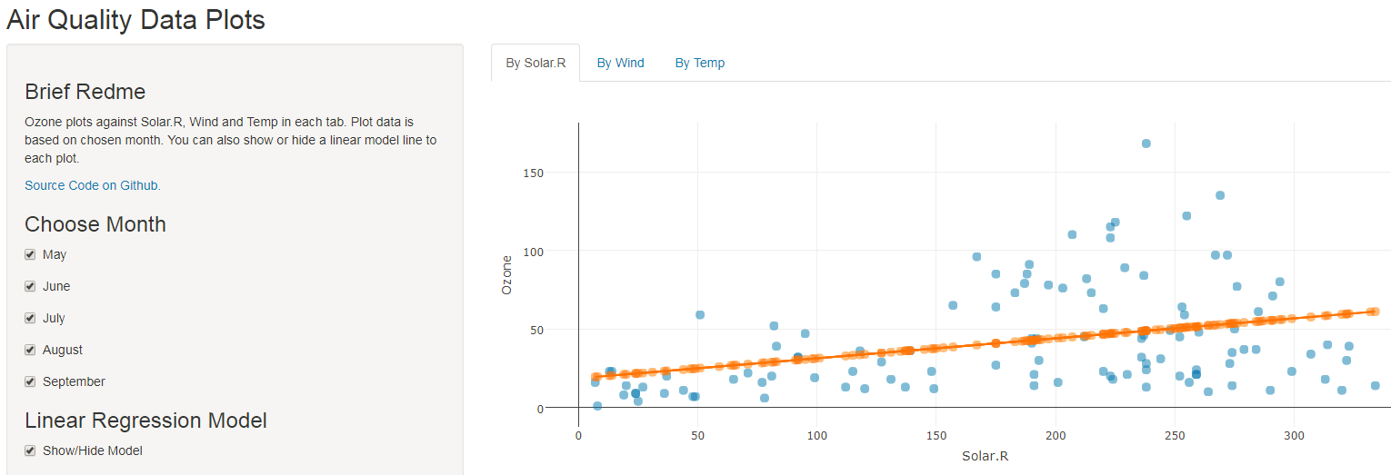
On left side sidebar panel, there are three sections:
Brief readme: a brief readme message on how to use the app.
Choose month: There are checkboxes to each month from May to September with which you can choose the month you are interested.
by default, data from all the five months are selected.
Show/Hide linear model to selected data. The app will show/hide a linear regression line to tell the data relation.
On right side main panel, there are three tabs to show following plots
- Ozone vs Solar.R
- Ozone vs Wind
- Ozone vs Temp
Takeaways
From this app, we can tell:
- when Solar.R values increase, Ozone values increase, a positive relation.
- when Wind values increase, Ozone values decrease, a negative relation.
but in June, there is a positive relation observed. - when Temp values increase, Ozone values increase, a positive relation.